Downsizing with Style
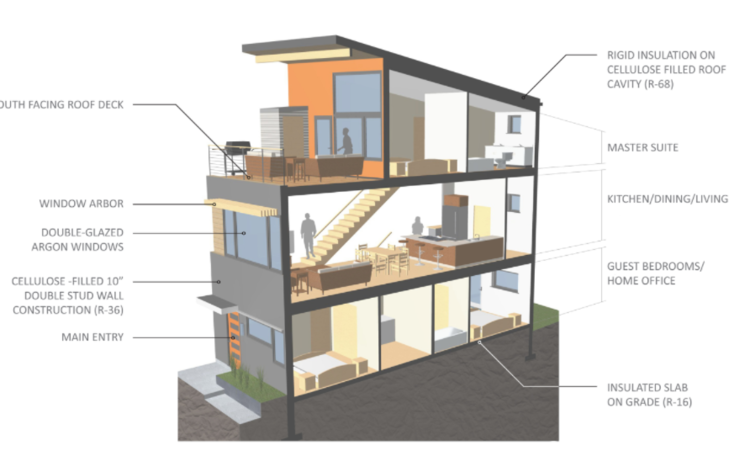
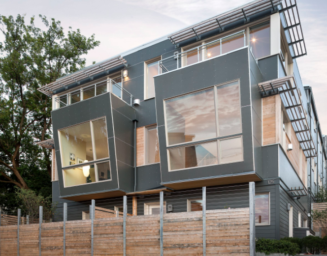
This couple downsized to a lovely 1100 sq foot home in Portland. We curated an immense collection of art, objects, and furnishings. The goal was to create a cohesive color story in each space to show as much art as possible without feeling cluttered. Creative storage was designed and built into the dining room, turning a dead space into a beautiful, functional part of the home. The 3 season porch was properly transformed into a year round office nook, and the smaller bedroom became a larger addition into a proper master bedroom thanks to the talent of Jamie Broadbent at Hellbent Design. Jamie designed the clients' previous Harborview Townhome and understood their aesthetic. The first two photos below are of that amazing project.
My goal was to honor the clients' love of art and ensure they could enjoy their day to day life by applying "aging in place" principles of design.
A glimpse of that journey:
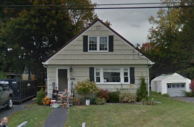
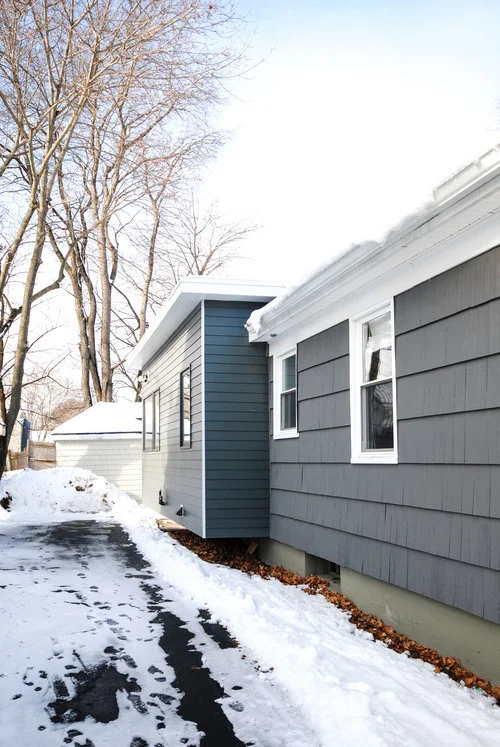
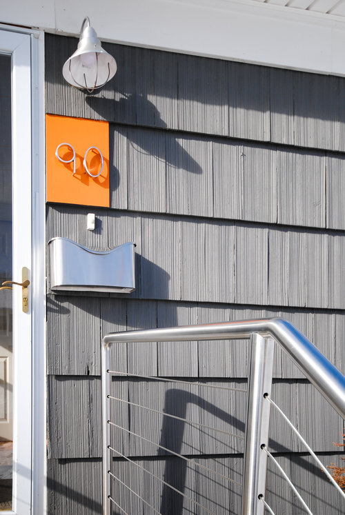
We expanded the smaller bedroom and streamlined the exterior.
We took into account lifestyle (durability for entertaining, pets), acquired a minimal amount of new items and focused on reimagining/repurposing existing pieces into my new design plan. I choose a deep, dramatic neutral as a proper background for artwork. Then I created color stories. I must confess this was a dream come true as I am an art fiend.
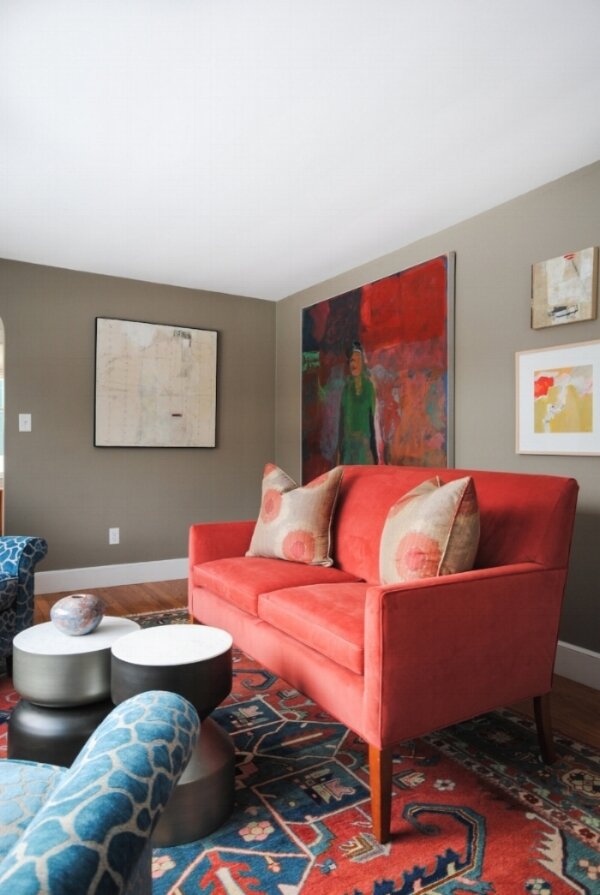
Modern, practical accents from CB2 and a settee we reupholstered pair perfectly with the existing rug and turquoise chairs. The art, from left to right:
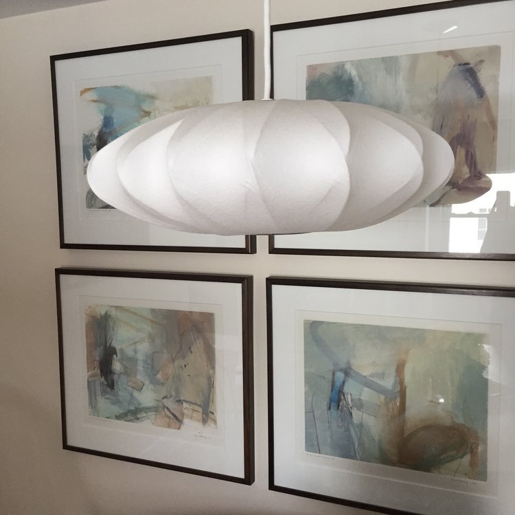
My favorite piece in the house is an encaustic called Mr. McBoingBoing by Maine artist Mary Path Hedstrom. The large painting behind the settee is called Summer Triptych 111 by Ed Douglass (MECA Faculty) and was a gift to the husband from his wife on his 50th birthday. It is one piece of a triptych. The upper right is "Less is More 2" by Lynn Wessle, a New Orleans artist who summers in Maine. The lower right is a mono print entitled " Lemon Sorbet" , by Jacqueline Carter. I believe between the foyer and living room we incorporated 13 or 14 pieces-not bad for a small space! The room tells a lovely story.
The paint color is Benjamin Moore’s Cole Stone.
My daughter approves of the space. The home owners met her as an infant and are experienced grandparents. She is treated like a VIP guest at this house!
From left to right:
3 Piece Ceramic Art by Shayla Marsh was wall mounted (and quite heavy), giving the feeling of floating art. It was obtained as part of a solo show, part of semantics exhibit at Lancaster Museum of Art. Ms.Marsh is the Student Director at Large at National Council for Education of Ceramic Arts. Terry Turrell is known for creating art on found objects. "Tea Bags", behind the antique chair, was painted on an old shutter. He is a self taught painter whose work is shown all over the world. Sculptor Dan Malczewski is a retired engineer who only carves horses. The clients liked the clean, elegant lines. I personally think it balances the collection.
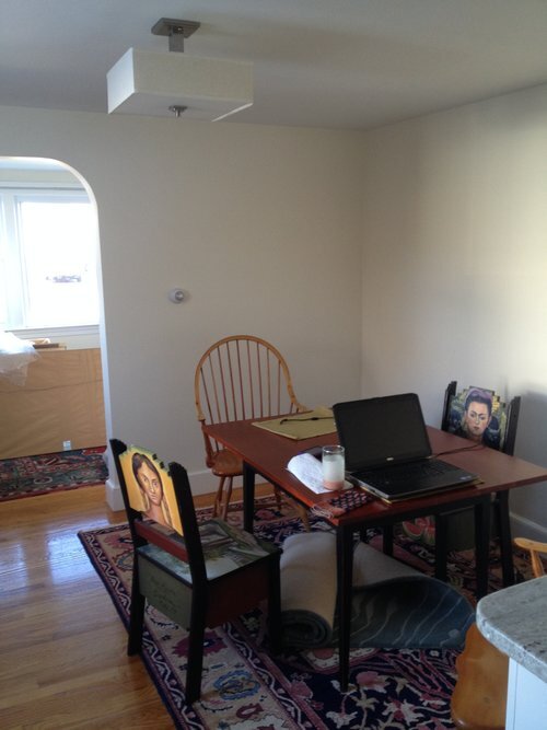
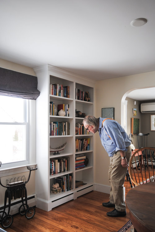
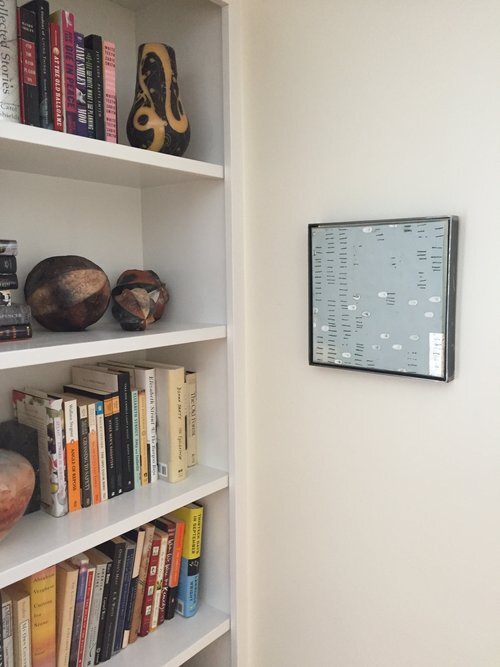
For the dining area, I suggested built in bookshelves to flank the only window. Bright white kept the room airy and matches the white kitchen cabinets (not shown). We maximized both storage and display opportunities. Very talented carpenters navigated the baseboard heaters (I am still impressed).
The third photo (L to R) features the newest addition to the collection from encaustic painter Dietland Vander Schaaf. For this room I pulled together a palette of lavender, purple and aqua. We moved an antique rug into the space and the deeper purple tones are accentuated by painter Tom DePaul's "Conversations". The focal point of the room is "Fine Arts Quartet Sequence". by Sante Fe artist Frank Ettenberg. He painted this while listening to Shostakovich's string quartets and if you look closely you can see music stands within painting. He was only willing to sell all 6 together as they correspond with different movements in the music.
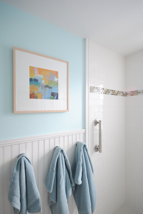
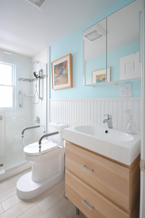
We modified this bathroom to accomodate aging in place. A walk in shower, new floating vanity, and a pop of color help this small space feel larger and a bit more modern. On the left is one of the client's favorite pieces, "Avelon" by Jacqueline Carter. On the right is "Autumn Adobe" by Joyce Hamil.
I hope to photograph the rest of this wonderful project later this year. Working with objects that are created, rather than reproduced, is a fulfilling experience!

